3 Scattered foundations
As we learned in Section 2.2, a plotly.js figure contains one (or more) trace(s), and every trace has a type. The trace type scatter is great for drawing low-level geometries (e.g., points, lines, text, and polygons) and provides the foundation for many add_*() functions (e.g., add_markers(), add_lines(), add_paths(), add_segments(), add_ribbons(), add_area(), and add_polygons()) as well as many ggplotly() charts. These scatter-based layers provide a more convenient interface to special cases of the scatter trace by doing a bit of data wrangling and transformation under-the-hood before mapping to scatter trace(s). For a simple example, add_lines() ensures lines are drawn according to the ordering of x, which is desirable for a time series plotting. This behavior is subtly different than add_paths() which uses row ordering instead.
library(plotly)
data(economics, package = "ggplot2")

# sort economics by psavert, just to
# show difference between paths and lines
p <- economics %>%
  arrange(psavert) %>%
  plot_ly(x = ~date, y = ~psavert)

add_paths(p)
add_lines(p)
FIGURE 3.1: The difference between add_paths() and add_lines(): the top panel connects observations according to the ordering of psavert (personal savings rate), whereas the bottom panel connects observations according to the ordering of x (the date).
Section 2.1 introduced ‘aesthetic mapping’ arguments (unique to the R package) which make it easier to map data to visual properties (e.g., color, linetype, etc). In addition to these arguments, dplyr groupings can be used to ensure there is at least one geometry per group. The top panel of Figure 3.1 demonstrates how group_by() could be used to effectively wrap the time series from Figure 3.1 by year, which can be useful for visualizing annual seasonality. Another approach to generating at least one geometry per ‘group’ is to provide categorical variable to a relevant aesthetic (e.g., color), as shown in the bottom panel of Figure 3.1.
library(lubridate)
econ <- economics %>%
  mutate(yr = year(date), mnth = month(date))

# one trace (more performant, but less interactive)
econ %>%
  group_by(yr) %>%
  plot_ly(x = ~mnth, y = ~uempmed) %>%
  add_lines(text = ~yr)

# multiple traces (less performant, but more interactive)
plot_ly(econ, x = ~mnth, y = ~uempmed) %>%
  add_lines(color = ~ordered(yr))

# the split argument guarantees one trace per group level (regardless of the variable type)
# this is useful if you want a consistent visual properties over multiple traces
# plot_ly(econ, x = ~mnth, y = ~uempmed) %>%
#   add_lines(split = ~yr, color = I("black"))
FIGURE 3.2: Drawing multiple lines using dplyr groups (top panel) versus a categorical color mapping (bottom panel). Comparatively speaking, the bottom panel has more interactive capabilites (e.g., legend-based filtering and multiple tooltips), but it does not scale as well with many lines.
Not only do these plots differ in visual appearance, they also differ in interactive capabilties, computational performance, and underlying implementation. That’s because, the grouping approach (top panel of Figure 3.2) uses just one plotly.js trace (more performant, less interactive), whereas the color approach (bottom panel of Figure 3.2) generates one trace per line/year. In this case, the benefit of having multiple traces is that we can perform interactive filtering via the legend and compare multiple y-values at a given x. The cost of having those capabilities is that plots starts to be become sluggish after a few hundred traces, whereas thousands of lines can be rendered fairly easily in one trace. See Chapter 24 for more details on scaling and performance.
These features make it easier to get started using plotly.js, but it still pays off to learn how to use plotly.js directly. You won’t find plotly.js attributes listed as explicit arguments in any plotly function (except for the special type attribute), but they are passed along verbatim to the plotly.js figure definition through the ... operator. The scatter-based layers in this chapter fix the type plotly.js attribute to "scatter" as well as the mode (e.g., add_markers() uses mode='markers' etc), but you could also use the lower-level add_trace() to work more directly with plotly.js. For example, Figure 3.3 shows how to render markers, lines, and text in the same scatter trace. It also demonstrates how to leverage nested plotly.js attributes, like textfont and xaxis – these attributes contain other attributes, so you need to supply a suitable named list to these arguments.
set.seed(99)
plot_ly() %>%
 add_trace(
   type = "scatter",
   mode = "markers+lines+text",
   x = 4:6,
   y = 4:6,
   text = replicate(3, praise::praise("You are ${adjective}! 🙌")),
   textposition = "right",
   hoverinfo = "text",
   textfont = list(family = "Roboto Condensed", size = 16)
 ) %>%
 layout(xaxis = list(range = c(3, 8)))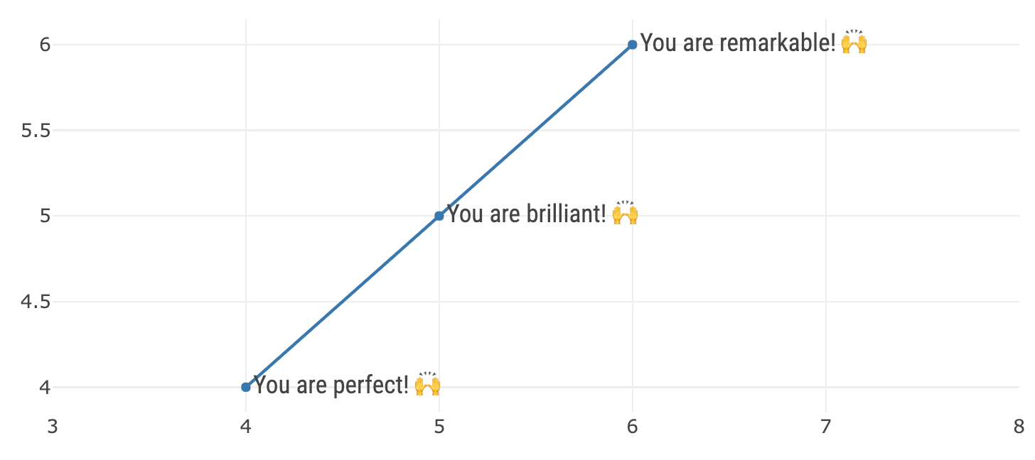
FIGURE 3.3: Using the generic add_trace() function to render markers, lines, and text in a single scatter trace. This add_trace() function, as well as any add_*() function allows you to directly specify plotly.js attributes.
If you are new to plotly.js, I recommend taking a bit of time to look through the plotly.js attributes that are available to the scatter trace type and think how you might be able to use them. Most of these attributes work for other trace types as well, so learning an attribute once for a specific plot can pay off in other contexts as well. The online plotly.js figure reference, https://plot.ly/r/reference/#scatter, is a decent place to search and learn about the attributes, but I recommend using the schema() function instead for a few reasons:
schema()provides a bit more information than the online docs (e.g., value types, default values, acceptable ranges, etc).- The interface makes it a bit easier to traverse and discover new attributes.
- You can be absolutely sure it matches the version used in the R package (the online docs might use a different – probably older – version).
schema()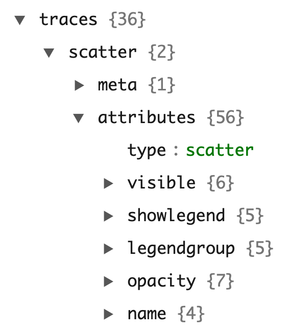
FIGURE 3.4: Using schema() function to traverse through the attributes available to a given trace type (e.g., scatter)
The sections that follow in this chapter demonstrate various type of data views using scatter-based layers. In attempt to avoid duplication of documentation, a particular emphasis is put on features only currently availble from the R package (e.g. the aesthetic mapping arguments).
3.1 Markers
This section details scatter traces with a mode of "markers" (i.e., add_markers()). For simplicity, many of the examples here use add_markers() with a numeric x and y axis, which results in scatterplot – a common way to visualize the association between two quantitative variables. The content that follows is still relevant markers displayed non-numeric x and y (aka dot pots) as shown in Section 3.1.6
3.1.1 Alpha blending
As Unwin (2015) notes, scatterplots can be useful for exposing other important features including: casual relationships, outliers, clusters, gaps, barriers, and conditional relationships. A common problem with scatterplots however is overplotting, meaning that there are multiple observations occupying the same (or similar) x/y locations. Figure 3.5 demonstrates one way to combat overplotting via alpha blending. When dealing with tens of thousands of points (or more), consider using toWebGL() to render plots using Canvas rather than SVG (more in Chapter 24, or leveraging 2D density estimation (section 7.2).
subplot(
  plot_ly(mpg, x = ~cty, y = ~hwy, name = "default"),
  plot_ly(mpg, x = ~cty, y = ~hwy) %>%
    add_markers(alpha = 0.2, name = "alpha")
)
FIGURE 3.5: Combating overplotting in a scatterplot with alpha blending.
3.1.2 Colors
As discussed in 2.2, mapping a discrete variable to color produces one trace per category, which is desirable for it’s legend and hover properties. On the other hand, mapping a numeric variable to color produces one trace, as well as a colorbar guide for visually decoding colors back to data values. The colorbar() function can be used to customize the appearance of this automatically generated guide. The default colorscale is viridis, a perceptually-uniform colorscale (even when converted to black-and-white), and perceivable even to those with common forms of color blindness (Data Science 2016). Viridis is also the default colorscale for ordered factors.
p <- plot_ly(mpg, x = ~cty, y = ~hwy, alpha = 0.5)
subplot(
  add_markers(p, color = ~cyl, showlegend = FALSE) %>%
    colorbar(title = "Viridis"),
  add_markers(p, color = ~factor(cyl))
)
FIGURE 3.6: Variations on a numeric color mapping.
There are numerous ways to alter the default color scale via the colors argument. This argument excepts one of the following: (1) a color brewer palette name (see the row names of RColorBrewer::brewer.pal.info for valid names), (2) a vector of colors to interpolate, or (3) a color interpolation function like colorRamp() or scales::colour_ramp(). Although this grants a lot of flexibility, one should be conscious of using a sequential colorscale for numeric variables (& ordered factors) as shown in 3.7, and a qualitative colorscale for discrete variables as shown in 3.8.
col1 <- c("#132B43", "#56B1F7")
col2 <- viridisLite::inferno(10)
col3 <- colorRamp(c("red", "white", "blue"))
subplot(
  add_markers(p, color = ~cyl, colors = col1) %>%
    colorbar(title = "ggplot2 default"),
  add_markers(p, color = ~cyl, colors = col2) %>%
    colorbar(title = "Inferno"),
  add_markers(p, color = ~cyl, colors = col3) %>%
    colorbar(title = "colorRamp")
) %>% hide_legend()
FIGURE 3.7: Three variations on a numeric color mapping.
col1 <- "Accent"
col2 <- colorRamp(c("red", "blue"))
col3 <- c(`4` = "red", `5` = "black", `6` = "blue", `8` = "green")
subplot(
  add_markers(p, color = ~factor(cyl), colors = col1),
  add_markers(p, color = ~factor(cyl), colors = col2),
  add_markers(p, color = ~factor(cyl), colors = col3)
) %>% hide_legend()
FIGURE 3.8: Three variations on a discrete color mapping.
As introduced in Figure 2.3, color codes can be specified manually (i.e., avoid mapping data values to a visual range) by using the I() function. Figure 3.9 provides a simple example using add_markers(). Any color understood by the col2rgb() function from the grDevices package can be used in this way. Chapter 27 provides even more details about working with different color specifications when specifying colors manually.
add_markers(p, color = I("black"))
FIGURE 3.9: Setting a fixed color directly using I().
The color argument is meant to control the ‘fill-color’ of a geometric object, whereas stroke (section 3.1.4) is meant to control the ‘outline-color’ of a geometric object. In the case of add_markers(), than means color maps to the plotly.js attribute marker.color and stroke maps to marker.line.color. Not all, but many, marker symbols have a notion of stroke.
3.1.3 Symbols
The symbol argument can be used to map data values to the marker.symbol plotly.js attribute. It uses the same semantics that we’ve already seen for color:
- A numeric mapping generates trace.
- A discrete mapping generates multiple traces (one trace per category).
- The plural,
symbols, can be used to specify the visual range for the mapping. - Mappings are avoided entirely through
I().
For example, the left panel of Figure 3.10 uses a numeric mapping and the right panel uses a discrete mapping. As a result, the left panel is linked to the first legend entry, whereas the right panel is linked to the bottom three legend entries. When plotting multiple traces and no color is specifed, the plotly.js colorway is applied (i.e., each trace will be rendered a different color). To set a fixed color, you can set the color of every trace generated from this layer with color = I("black"), or similar.
p <- plot_ly(mpg, x = ~cty, y = ~hwy, alpha = 0.3)
subplot(
  add_markers(p, symbol = ~cyl, name = "A single trace"),
  add_markers(p, symbol = ~factor(cyl), color = I("black"))
)
FIGURE 3.10: Mapping symbol to a numeric variable (left panel) and a factor (right panel).
There are two ways to specify the visual range of symbols: (1) numeric codes (interpreted as a pch codes) or (2) a character string specifying a valid marker.symbol value. Figure 3.11 uses pch codes (left panel) as well as their corresponding marker.symbol name (right panel) to specify the visual range.
subplot(
  add_markers(p, symbol = ~cyl, symbols = c(17, 18, 19)),
  add_markers(
    p, color = I("black"),
    symbol = ~factor(cyl), symbols = c("triangle-up", "diamond", "circle")
  )
)
FIGURE 3.11: Specifying the visual range of symbols.
These symbols (i.e., the visual range) can also be supplied directly to symbol through I(). For example, Figure 3.12 fixes the marker symbol to a diamond shape.
plot_ly(mpg, x = ~cty, y = ~hwy) %>%
  add_markers(symbol = I(18), alpha = 0.5)
FIGURE 3.12: Setting a fixed symbol directly using I().
If you’d like to see all the symbols available to plotly, as well as a method for supplying your own custom glyphs, see Chapter 28.
3.1.4 Stroke and span
The stroke argument follows the same semantics as color and symbol when it comes to variable mappings and specifying visual ranges. Typically you don’t want to map data values to stroke, you just want to specify a fixed outline color. For example, Figure 3.13 modifies Figure 3.12 to simply add a black outline. By default, the span, or width of the stroke, is zero, you’ll likely want to set the width to be around one pixel.
plot_ly(mpg, x = ~cty, y = ~hwy) %>%
  add_markers(symbol = I(18), alpha = 0.5, stroke = I("black"), span = I(1))
FIGURE 3.13: Using stroke and span to control the outline color as well as the width of that outline.
3.1.5 Size
For scatterplots, the size argument controls the area of markers (unless otherwise specified via sizemode), and must be a numeric variable. The sizes argument controls the minimum and maximum size of circles, in pixels:
p <- plot_ly(mpg, x = ~cty, y = ~hwy, alpha = 0.3)
subplot(
  add_markers(p, size = ~cyl, name = "default"),
  add_markers(p, size = ~cyl, sizes = c(1, 500), name = "custom")
)
FIGURE 3.14: Controlling the size range via sizes (measured in pixels).
Similar to other arguments, I() can be used to specify the size directly. In the case of markers, size controls the marker.size plotly.js attribute. Remember, you always have the option to set this attribute directly by doing something similar to Figure 3.15.
plot_ly(mpg, x = ~cty, y = ~hwy, alpha = 0.3, marker = list(size = 10))
FIGURE 3.15: Setting a fixed marker size directly using marker.size.
3.1.6 Dotplots & error bars
A dotplot is similar to a scatterplot, except instead of two numeric axes, one is categorical. The usual goal of a dotplot is to compare value(s) on a numerical scale over numerous categories. In this context, dotplots are preferable to pie charts since comparing position along a common scale is much easier than comparing angle or area (Cleveland and McGill 1984); (Bostock 2010). Furthermore, dotplots can be preferable to bar charts, especially when comparing values within a narrow range far away from 0 (Few 2006). Also, when presenting point estimates, and uncertainty associated with those estimates, bar charts tend to exaggerate the difference in point estimates, and lose focus on uncertainty (Messing 2012).
A popular application for dotplots (with error bars) is the so-called “coefficient plot” for visualizing the point estimates of coefficients and their standard error. The coefplot() function in the coefplot package (Lander 2016) and the ggcoef() function in the GGally both produce coefficient plots for many types of model objects in R using ggplot2, which we can translate to plotly via ggplotly(). Since these packages use points and segments to draw the coefficient plots, the hover information is not the best, and it’d be better to use error objects. Figure 3.16 uses the tidy() function from the broom package (Robinson 2016) to obtain a data frame with one row per model coefficient, and produce a coefficient plot with error bars along the x-axis.
library(broom)
library(forcats)

# Fit a full-factorial linear model
m <- lm(Sepal.Length ~ Sepal.Width * Petal.Length * Petal.Width, data = iris)

# (1) get a tidy() data structure of covariate-level info (e.g., point estimate, standard error, etc)
# (2) make sure term column is a factor ordered by the estimate
# (3) plot estimate by term with an error bar for the standard error
tidy(m) %>%
  mutate(term = fct_reorder(term, estimate)) %>%
  plot_ly(x = ~estimate, y = ~term) %>%
  add_markers(
    error_x = ~list(value = std.error),
    color = I("black"),
    hoverinfo = "x"
  )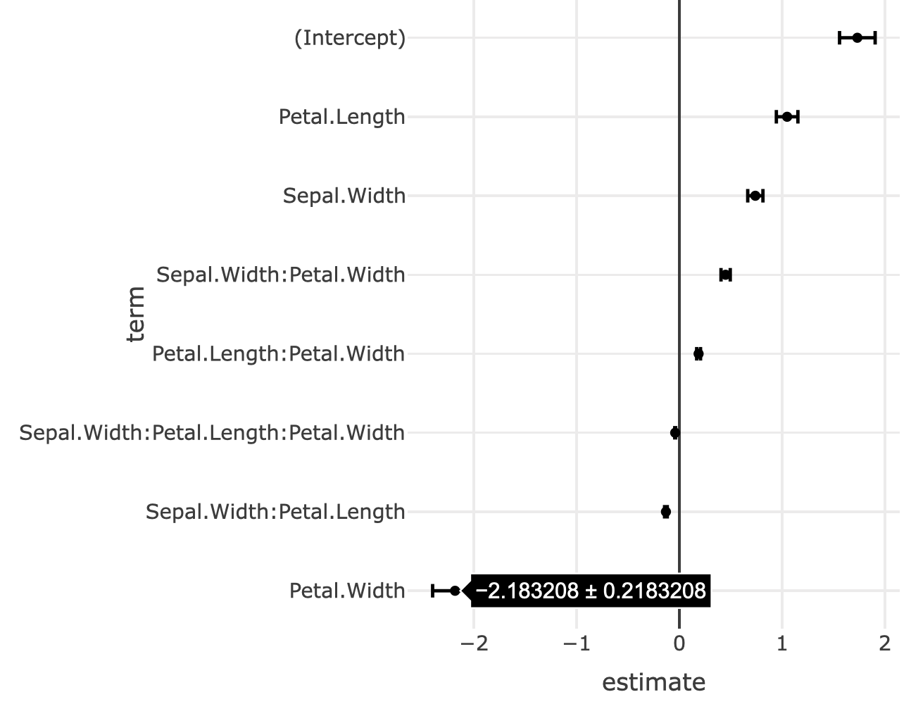
FIGURE 3.16: A coefficient plot.
3.2 Lines
Many of the same principles we learned about aesthetic mappings with respect to markers (Section 3.1) also apply to lines.10 Moreover, at the start of this chapter (namely Figure 3.2) we also learned how to use dplyr’s group_by() to ensure there is at least one geometry (in this case, line) per group. We also learned the difference between add_paths() and add_lines() – the former draws lines according to row ordering whereas the latter draw them according to x. In this chapter, we’ll learn about linetype/linetype, an aesthetic that applies to lines and polygons. We’ll also discuss some other important chart types that can be implemented with add_paths(), add_lines(), and add_segments().
3.2.1 Linetypes
Generally speaking, it’s hard to perceive more than 8 different colors/linetypes/symbols in a given plot, so sometimes we have to filter data to use these effectively. Here we use the dplyr package to find the top 5 cities in terms of average monthly sales (top5), then effectively filter the original data to contain just these cities via semi_join(). As Figure 3.17 demonstrates, once we have the data filtered, mapping city to color or linetype is trivial. The color palette can be altered via the colors argument, and follows the same rules as scatterplots. The linetype palette can be altered via the linetypes argument, and accepts R’s lty values or plotly.js dash values.
library(dplyr)
top5 <- txhousing %>%
  group_by(city) %>%
  summarise(m = mean(sales, na.rm = TRUE)) %>%
  arrange(desc(m)) %>%
  top_n(5)

tx5 <- semi_join(txhousing, top5, by = "city")

plot_ly(tx5, x = ~date, y = ~median) %>%
  add_lines(linetype = ~city)
FIGURE 3.17: Using color and/or linetype to differentiate groups of lines.
If you’d like to control exactly which linetype is used to encode a particular data value, you can provide a named character vector, like in Figure 3.18. Note that this is similar to how we provided a discrete colorscale manually for markers in Figure 3.8.
ltys <- c(
  Austin = "dashdot",
  `Collin County` = "longdash",
  Dallas = "dash",
  Houston = "solid",
  `San Antonio` = "dot"
)

plot_ly(tx5, x = ~date, y = ~median) %>%
  add_lines(linetype = ~city, linetypes = ltys)
FIGURE 3.18: Providing a named character vector to linetypes in order to control exactly what linetype gets mapped to which city.
3.2.2 Segments
The add_segments() function essentially provides a way to connect two points [(x, y) to (xend, yend)] with a line. Segments form the building blocks for numerous useful chart types, including slopegraphs, dumbell charts, candlestick charts, and more. Slopegraphs and dumbell charts are useful for comparing numeric values across numerous categories. Candlestick charts are typically used for visualizing change in a financial asset over time.
Segments can also provide a useful alternative to add_bars() (covered in Section 5), especially for animations. In particular, Figure 14.5 of Section 14.2 shows how implement an animated population pyramid using segments instead of bars.
3.2.2.1 Slopegraph
The slope graph, made popular by Tufte (2001b), is a great way to compare the change in a measurement across numerous groups. This change could be along either a discrete or a continuous axis. For a continuous axis, the slopegraph could be thought of as a decomposition of a line graph into multiple segments. The slopegraph R package provides a succinct interface for creating slopegraphs with base or ggplot2 graphics and also some convenient data sets which we’ll make use of here (Leeper 2017). Figure 3.19 recreates an example from Tufte (2001b), using the gdp data set from slopegraph, and demonstrates a common issue with labelling in slopegraphs – it’s easy to have overlapping labels when anchoring labels on data values. For that reason, this implementation leverages plotly ability to interactively edit annotation positions. See Section 12 for similar examples of ‘editing views’.
Click to show code
data(gdp, package = "slopegraph")
gdp$Country <- row.names(gdp)

plot_ly(gdp) %>%
  add_segments(
    x = 1, xend = 2,
    y = ~Year1970, yend = ~Year1979,
    color = I("gray90")
  ) %>%
  add_annotations(
    x = 1, y = ~Year1970,
    text = ~paste(Country, "  ", Year1970),
    xanchor = "right", showarrow = FALSE
  ) %>%
  add_annotations(
    x = 2, y = ~Year1979,
    text = ~paste(Year1979, "  ", Country),
    xanchor = "left", showarrow = FALSE
  ) %>%
  layout(
    title = "Current Receipts of Goverment as a Percentage of Gross Domestic Product",
    showlegend = FALSE,
    xaxis = list(
      range = c(0, 3),
      ticktext = c("1970", "1979"),
      tickvals = c(1, 2),
      zeroline = FALSE
    ),
    yaxis = list(
      title = "",
      showgrid = FALSE,
      showticks = FALSE,
      showticklabels = FALSE
    )
  ) %>%
  config(edits = list(annotationPosition = TRUE))
FIGURE 3.19: Interactively editing the label positioning in a slopegraph.
3.2.2.2 Dumbell
So called dumbell charts are similar in concept to slope graphs, but not quite as general. They are typically used to compare two different classes of numeric values across numerous groups. Figure 3.20 uses the dumbell approach to show average miles per gallon city and highway for different car models. With a dumbell chart, it’s always a good idea to order the categories by a sensible metric – for Figure 3.20, the categories are ordered by the city miles per gallon.
mpg %>%
  group_by(model) %>%
  summarise(c = mean(cty), h = mean(hwy)) %>%
  mutate(model = forcats::fct_reorder(model, c)) %>%
  plot_ly() %>%
  add_segments(
    x = ~c, y = ~model,
    xend = ~h, yend = ~model,
    color = I("gray"), showlegend = FALSE
  ) %>%
  add_markers(
    x = ~c, y = ~model,
    color = I("blue"),
    name = "mpg city"
  ) %>%
  add_markers(
    x = ~h, y = ~model,
    color = I("red"),
    name  = "mpg highway"
  ) %>%
  layout(xaxis = list(title = "Miles per gallon"))
FIGURE 3.20: A dumbell chart of mile per gallon city vs highway by model of car.
3.2.2.3 Candlestick
Figure 3.21 uses the quantmod package (Ryan 2016) to obtain stock price data for Microsoft and plots two segments for each day: one to encode the opening/closing values, and one to encode the daily high/low.
library(quantmod)
msft <- getSymbols("MSFT", auto.assign = F)
dat <- as.data.frame(msft)
dat$date <- index(msft)
dat <- subset(dat, date >= "2016-01-01")

names(dat) <- sub("^MSFT\\.", "", names(dat))

plot_ly(dat, x = ~date, xend = ~date, color = ~Close > Open,
        colors = c("red", "forestgreen"), hoverinfo = "none") %>%
  add_segments(y = ~Low, yend = ~High, size = I(1)) %>%
  add_segments(y = ~Open, yend = ~Close, size = I(3)) %>%
  layout(showlegend = FALSE, yaxis = list(title = "Price")) %>%
  rangeslider()
FIGURE 3.21: A candlestick chart built out of segments
3.2.3 Density plots
In Section 5, we leverage a number of algorithms in R for computing the “optimal” number of bins for a histogram, via hist(), and routing those results to add_bars(). We can leverage the density() function for computing kernel density estimates in a similar way, and route the results to add_lines(), as is done in 3.22.
kerns <- c("gaussian", "epanechnikov", "rectangular",
          "triangular", "biweight", "cosine", "optcosine")
p <- plot_ly()
for (k in kerns) {
  d <- density(economics$pce, kernel = k, na.rm = TRUE)
  p <- add_lines(p, x = d$x, y = d$y, name = k)
}
p
FIGURE 3.22: Various kernel density estimates.
3.2.4 Parallel Coordinates
One very useful, but often overlooked, visualization technique is the parallel coordinates plot. Parallel coordinates provide a way to compare values along a common (or non-aligned) positional scale(s) – the most basic of all perceptual tasks – in more than 3 dimensions (Cleveland and McGill 1984). Usually each line represents every measurement for a given row (or observation) in a data set. It’s true that plotly.js provides a trace type, parcoords, specifically for parallel coordinates, but
When measurements are on very different scales, some care must be taken, and variables must transformed to be put on a common scale. As Figure 3.23 shows, even when variables are measured on a similar scale, it can still be informative to transform variables in different ways.
iris$obs <- seq_len(nrow(iris))
iris_pcp <- function(transform = identity) {
  iris[] <- purrr::map_if(iris, is.numeric, transform)
  tidyr::gather(iris, variable, value, -Species, -obs) %>%
    group_by(obs) %>%
    plot_ly(x = ~variable, y = ~value, color = ~Species) %>%
    add_lines(alpha = 0.3)
}
subplot(
  iris_pcp(),
  iris_pcp(scale),
  iris_pcp(scales::rescale),
  nrows = 3, shareX = TRUE
) %>% hide_legend()
FIGURE 3.23: Parallel coordinates plots of the Iris dataset. The top panel shows all variables on a common scale. The middle panel scales each variable to have mean of 0 and standard deviation of 1. In the bottom panel, each variable is scaled to have a minimum of 0 and a maximum of 1.
It is also worth noting that the GGally offers a ggparcoord() function which creates parallel coordinate plots via ggplot2, which we can convert to plotly via ggplotly(). Thanks to the linked highlighting framework, parallel coordinates created in this way could be linked to lower dimensional (but sometimes higher resolution) graphics of related data to guide multi-variate data exploration. The pedestrians package provides some examples of linking parallel coordinates to other views such as a grand tour for exposing unusual features in a high-dimensional space (Sievert 2019a).
3.3 Polygons
The add_polygons() function is essentially equivalent to add_paths() with the fill attribute set to “toself”. Polygons form the basis for other, higher-level scatter-based layers (e.g., add_ribbons() and add_sf()) that don’t have a dedicated plotly.js trace type. Polygons can be use to draw many things, but perhaps the most familiar application where you might want to use add_polygons() is to draw geo-spatial objects. If and when you use add_polygons() to draw a map, make sure you fix the aspect ratio (e.g. xaxis.scaleanchor). On the other hand, Section 4.2 shows you how to make a custom maps using the sf package and add_sf(), which is a bit a work to get started, but is absolutely worth the investment.
base <- map_data("world", "canada") %>%
  group_by(group) %>%
  plotly_empty(x = ~long, y = ~lat, alpha = 0.2) %>%
  layout(showlegend = FALSE, xaxis = list(scaleanchor = "y"))

base %>%
  add_polygons(hoverinfo = "none", color = I("black")) %>%
  add_markers(text = ~paste(name, "<br />", pop), hoverinfo = "text",
              color = I("red"), data = maps::canada.cities)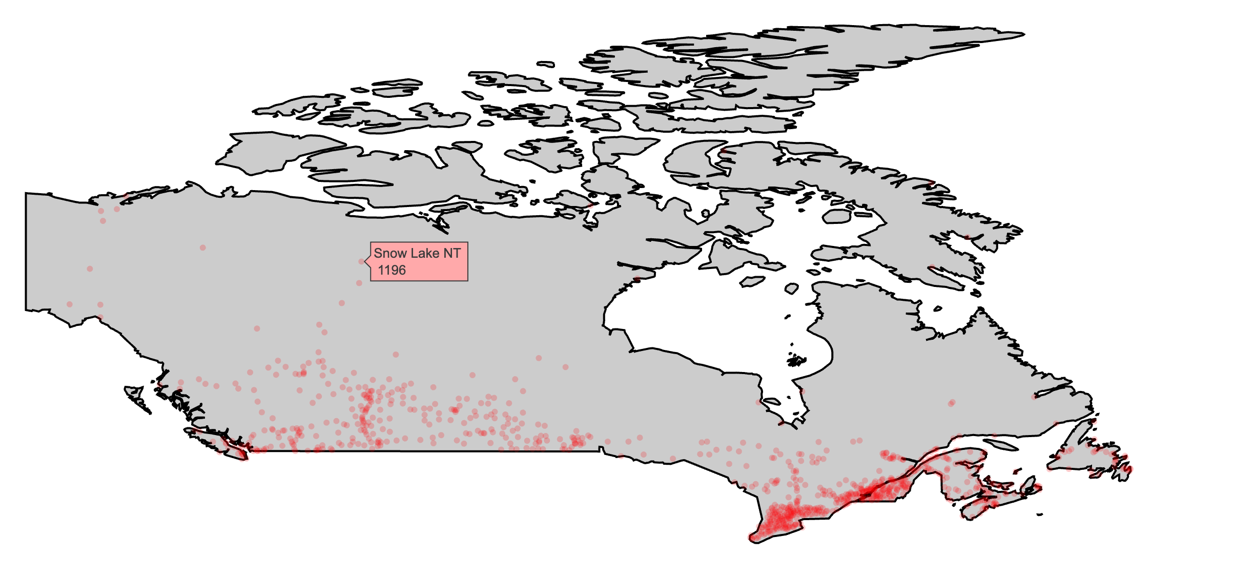
FIGURE 3.24: Using add_polygons() to make a map of Canada and major Canadian cities via data provided by the maps package (Richard A. Becker, Ray Brownrigg. Enhancements by Thomas P Minka, and Deckmyn. 2018).
As discussion surrounding Figure 4.9 points out, scatter-based polygon layers (i.e., add_polygons(), add_ribbons(), etc) render all the polygons using one plotly.js trace by default. This approach is computationally efficient, but it’s not always desirable (e.g. can’t have multiple fills per trace, interactivity is relatively limited). To work around the limitations, consider using split (or color with a discrete variable) to split the polygon data into multiple traces. Figure 3.25 demonstrates using split which will impose plotly.js’ colorway to each trace (i.e., subregion) and leverage hoveron to generate one tooltip per sub-region.
add_polygons(base, split = ~subregion, hoveron = "fills")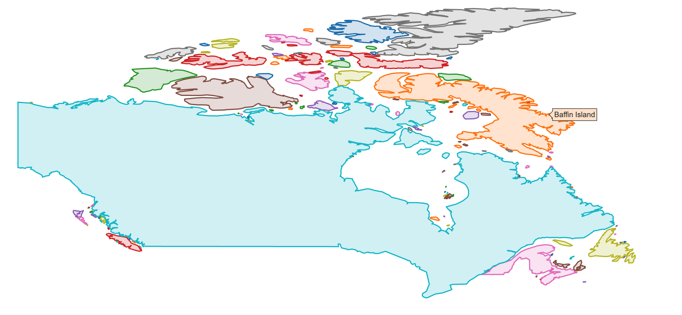
FIGURE 3.25: Using split to render polygons with different fills and interactive properties.
3.3.1 Ribbons
Ribbons are useful for showing uncertainty bounds as a function of x. The add_ribbons() function creates ribbons and requires the arguments: x, ymin, and ymax. The augment() function from the broom package appends observational-level model components (e.g., fitted values stored as a new column .fitted) which is useful for extracting those components in a convenient form for visualization. Figure 3.26 shows the fitted values and uncertainty bounds from a linear model object.
m <- lm(mpg ~ wt, data = mtcars)
broom::augment(m) %>%
  plot_ly(x = ~wt, showlegend = FALSE) %>%
  add_markers(y = ~mpg, color = I("black")) %>%
  add_ribbons(ymin = ~.fitted - 1.96 * .se.fit,
              ymax = ~.fitted + 1.96 * .se.fit, color = I("gray80")) %>%
  add_lines(y = ~.fitted, color = I("steelblue"))
FIGURE 3.26: Plotting fitted values and uncertainty bounds of a linear model via the broom package.
References
Unwin, Antony. 2015. Graphical Data Analysis with R. CRC Press. http://www.gradaanwr.net.
Data Science, Berkeley Institute for. 2016. “Mpl Colormaps.” 2016. http://web.archive.org/web/20160601125258/http://bids.github.io/colormap/.
Cleveland, William S, and Robert McGill. 1984. “Graphical Perception: Theory, Experimentation, and Application to the Development of Graphical Methods.” Journal of the American Statistical Association 79 (September): 531–54.
Bostock, Jeffrey Heer AND Michael. 2010. “Crowdsourcing Graphical Perception: Using Mechanical Turk to Assess Visualization Design.” In ACM Human Factors in Computing Systems (Chi), 203–12. http://vis.stanford.edu/papers/crowdsourcing-graphical-perception.
Few, Stephen. 2006. “Data Visualization: Rules for Encoding Values in Graph.” 2006. https://web.archive.org/web/20160404214629/http://www.perceptualedge.com/articles/b-eye/encoding_values_in_graph.pdf.
Messing, Solomon. 2012. “Visualization Series: Insight from Cleveland and Tufte on Plotting Numeric Data by Groups.” 2012. http://web.archive.org/web/20160602202734/https://solomonmessing.wordpress.com/2012/03/04/visualization-series-insight-from-cleveland-and-tufte-on-plotting-numeric-data-by-groups/.
Lander, Jared P. 2016. Coefplot: Plots Coefficients from Fitted Models. https://CRAN.R-project.org/package=coefplot.
Robinson, David. 2016. Broom: Convert Statistical Analysis Objects into Tidy Data Frames. https://CRAN.R-project.org/package=broom.
Tufte, Edward. 2001b. The Visual Display of Quantitative Information. Cheshire, Conn: Graphics Press.
Leeper, Thomas J. 2017. Slopegraph: Edward Tufte-Inspired Slopegraphs.
Ryan, Jeffrey A. 2016. Quantmod: Quantitative Financial Modelling Framework. https://CRAN.R-project.org/package=quantmod.
Sievert, Carson. 2019a. Pedestrians: Tools for Exploring Melbourne’s Pedestrian Data. https://github.com/cpsievert/pedestrians.
Richard A. Becker, Original S code by, Allan R. Wilks. R version by Ray Brownrigg. Enhancements by Thomas P Minka, and Alex Deckmyn. 2018. Maps: Draw Geographical Maps. https://CRAN.R-project.org/package=maps.
At the time of writing, the plotly.js attributes
line.widthandline.colordo not support multiple values, meaning a single line trace can only have one width/color in 2D line plot, and consequently numericcolor/sizemappings won’t work. This isn’t necessarily true for 3D paths/lines and there will likely be support these features for 2D paths/lines in WebGL in the near future.↩